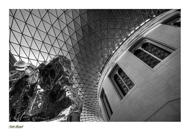
The British Museum
† 28-01-2009 † 10511 views
Visitor's Comments
- Ronnie 2¢ (Homepage) wrote: Looks good in b&w : reminds me of the trouble I had trying to correct color balance under that strange roof !
- LightningPaul (Homepage) wrote: I love the angle and perspective in this one. Nice!
- Denis (Homepage) wrote: paolo , you are simply a master for these architectural photos.
- lgb (Homepage) wrote: Great composition and lighting. Excellent image!
- TP@Photoskiasi.com (Homepage) wrote: I like the way you used those lines. Very nice composition and b/w tones.
- Tiziano (Homepage) wrote: Che spettacolo di prospettiva. Ottimo bianco e nero
- gavin hart (Homepage) wrote: Great swirling pattern of the roof and great angles. Nicely framed. I'm curious about the exhibit in foreground at the left?
- siam (Homepage) wrote: The British Museum very rich in history, I love this black and white, which is very achieve angle in this
- Beat (Homepage) wrote: clear and beautifull
- Omar (Homepage) wrote: cool architectural picture, I like the angle of this shot
- Ida (Homepage) wrote: I really enjoy angles of your photos :) excellent image :)
- Laurie (Homepage) wrote: Such powerful lines in this. The architectural detail is really wonderful here.
- Andres (Homepage) wrote: Excellent wide angle.
- Susan (Homepage) wrote: This is a very intriguing image...love the perspective and the black and white processing.
- grant (Homepage) wrote: a very dramatic photo!
- Andy (Homepage) wrote: Awesome angle for this shot. That shiny artwork on the left really is cool! Love the patterns of the roof as well.
- Arjan - PlasticDaisy (Homepage) wrote: Stunning! Such crisp and vivid processing!
- Krims@nline.be (Homepage) wrote: Wow a really beautifull archtitectural picture. Love the game of lines in. Excellent choice of color. Well done!
- cashondeo (Homepage) wrote: Muy bueno el punto de vista de tu foto ! Y la luz que tiene esas piedras de la izquierda es genial !
- Alex (Homepage) wrote: Me parece espectacular, todo acristalado...buen trabajo con la desaturacion y el procesado, saludos.
- Pradeep (Homepage) wrote: Love this composition, the sculpture on the left really provides a wonderful contrast...very nice :)
- Michael Paulison (Homepage) wrote: This is really nice in a lot of ways. The clarity is superb. The tone of the black and white is perfect. The graphical composition makes it very interesting.
- Andrew (Homepage) wrote: Superb clarity, and captivating lines. This image is not just a photograph to see, but is an experience to feel with your mind.
- Robert Kruh (Homepage) wrote: Nice view, fancy details, lovely reflection on windows. Bravo!
- Eric (Homepage) wrote: Well composed n converted in B&W.
- BoB (Homepage) wrote: bella inquadratura
- jo (Homepage) wrote: Such beauty stretching overhead. That globular object on the left is a wonderfully mysterious addition!
- Polydactyle (Homepage) wrote: A lot of great textures and lines. Strong composition.
- sherri (Homepage) wrote: Incredible structure. The greyscale really shows the details nicely.
- Ivar (Homepage) wrote: Nice picture with great patterns and contrasts. Like the angle you took this from.
- Micke Bergling (Homepage) wrote: wow..cool shot..
- aadesanya (Homepage) wrote: great patterns and nice conversion


Add Your Comment